Why do I separate the landing page into three categories? What’s the difference between Good and Awesome? Initially I got this categorization when I did A / B testing on several landing pages for some products. Based on the test results, I finally got the three categories for landing pages, which are:
- When first seeing it, the user explores the page but ends up not liking the design, because it’s too old (Bad).
- Users are very interested in landing pages that have attractive designs, they stay on the page more than a minute. But they don’t understand the product and don’t want to try using it (Good).
- Users are interested, want to read, understand and immediately want to try the product because it is given a sense of security as well as clear benefits for the user (Awesome).
In the previous article, we talked about How important is the Landing Page in the User Experience? with the example of the Laundry Case. But, in this article I wanna share my thoughts about the bad, good and wow Landing Page based on users insights and a case study. Enjoy Reading!
Introduction
If we look back at the laundry case, then we can imagine that the laundry has several service packages, such as:
- Package A washing, ironing clothes just 1 hour days finish
- Package B washing, ironing clothes in 3 days finish
- Package C washing, ironing clothes in 5 days finish
All three have the same goal to make clean clothes in the allotted time. But the difference is the level of speed and efficiency. If you choose package c, then in 5 days, the clothes will be clean and neat. Meanwhile, if you choose package B, in 3 days your clothes will be clean and neat (benefit: and you save 2 days) but if you choose package A, your clothes will be clean and neat in just 1 hour (benefit: you can save 4 days and 23 hours). The goal is the same, but the process is different. This is similar to the three landing page categories, the bad, good and awesome.
Principle of Landing Page
A landing page must be a page that provides information and clear ways for users to act and make decisions. In this page, product information must be descriptive, persuasive, and benefit the user. So users will be interested in knowing more details about the products offered. Here some point that important in build the landing page:
- Clear Information and Path of Action
Product information should be clear and easy to understand. Copywriting is the key on this stage. Copywriting sometimes becomes something that is often taken lightly, when in fact it is something that has a large impact in conveying product information to users. Please take a look of the image above

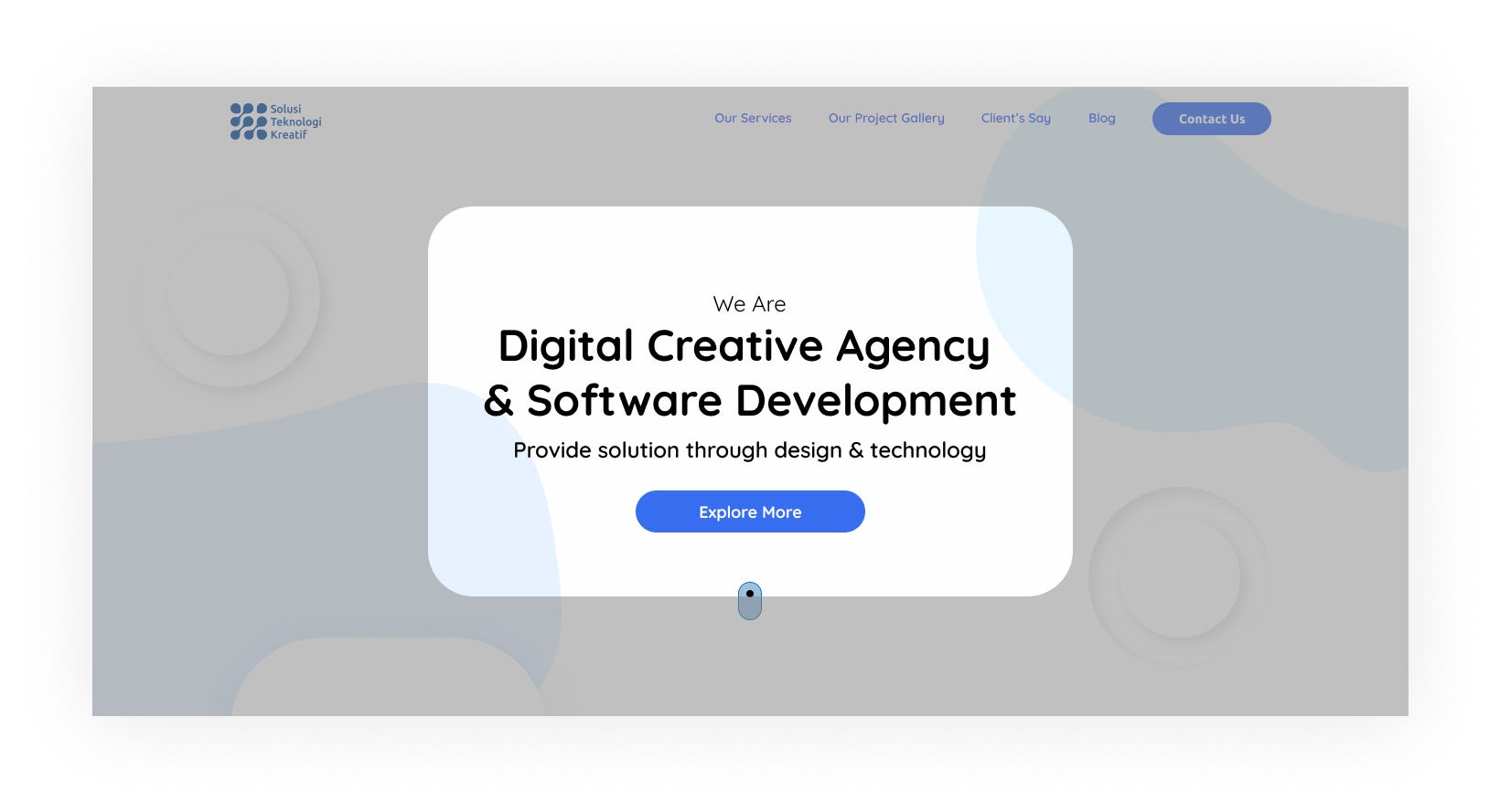
In a simple way, when you see the text on image A that says, “We are a Creative Technology Solution” and the text on image B, “We are Digital Creative Agency & Software Development”, you will be more trusting on the product offered by image B. Because the product information on the image B is quite clear and direct about the services offered. The first thing you need to see and know is not the name of the Agency / Company, but the service they offer. So when you see image A and image B with text on it, you will be more interested and trusting in the products offered by B. Besides that, we can also insert testimonials from our clients to build trust in users. If the information about the product has been inserted perfectly on the landing page, then you should think about the path of action.
Path of action is a type of flow that takes users from getting to know the product, seeing, till wanting to use the product / service offered. It is usually identical to the action / CTA button (CTA = Call To Action) that will be displayed on the landing page. CTA is something important to the user. The CTA button should be visible and have the appropriate label on it. Take a look back at images A and B. Image A has the CTA button “Contact Us” below the text that says, “Solusi Teknologi Kreatif”. Meanwhile the image B has the CTA button “Explore More”. If we compared the CTA on image A and B, we will get that CTA A does not persuade the users to find out more about the product, because CTA A directly ask users to contact the product owner by clicking the “Contact Us” without giving the user the opportunity to find out more about the product. So the CTA B is a more useful and better path because it directs the user to find out more about the products offered and leads users to have a desire to buy the product.
2. Visual Hierarchy
If we talk about the visual hierarchy, it is related to the design right? Design is related to first impressions. If likened, design is a door that can determine whether the user will open it to enter or just pass it. So if the door is ugly, the user will just pass through it and maybe not even glance at it. Because the door represents what is inside. Although there is a saying, “don’t judge a book by it’s cover”, still humans do it. Let talk about the visual hierarchy based on interaction design foundation that a designer can use to influence users’ perception:
- Size: the larger element will attract more attention
- Color: bright colors are more likely to draw attention over muted ones
- Contrast: catch the eye easily
- Alignment: an element that breaks away from the alignment of others will attract more attention
- Repetition: repeating styles can give the impression that content is related
- Proximity: closely placed elements will also appear related (based on Gestalt theory)
- Whitespace: more space around elements will attract the eye toward them and give the user space to breath
- Texture and Style: richer textures will attract more attention than flat ones
Besides that, the landing page design must be specific, simple, consistent, had headlines and had a positive first impression.
3. Benefits
When designing a landing page, we should give the benefit to the user. Benefit for users is the important thing for them to attract their attention. For example, we can give them service for free trial or maybe join for free. So the user will feel the benefits without paying anything. We can offer this information in the first text that will show up (without scrolling) to attract their attention.
4. Function
Of all the principles, the main thing is function, which is how the web functions properly from a technical perspective. This usually applies to CTA functions, navigation, scrolling, and so on. Because even though the landing page has good information, flow and design, when it doesn’t work, all the principles will be useless. So, make sure that the landing page is functioning properly.
The Bad Landing Page
How do landing pages get bad? Bad is a type of subjective word if we put it without data. We can call it bad if the landing page doesn’t have all principle points, such as not having clear information, visible CTA (Call to Action, ex: button), not giving a benefit to the user, too much content, no contrast, not usable, confusing, the design is too old and etc. I have done case studies on several landing pages that I have made, and it works. In July 2019, I redesigned several landing pages for 1 product and did the A/B Testing to 30% of users (based on target). This is a landing page that is turned out to be a bad landing page based on A/B Test.
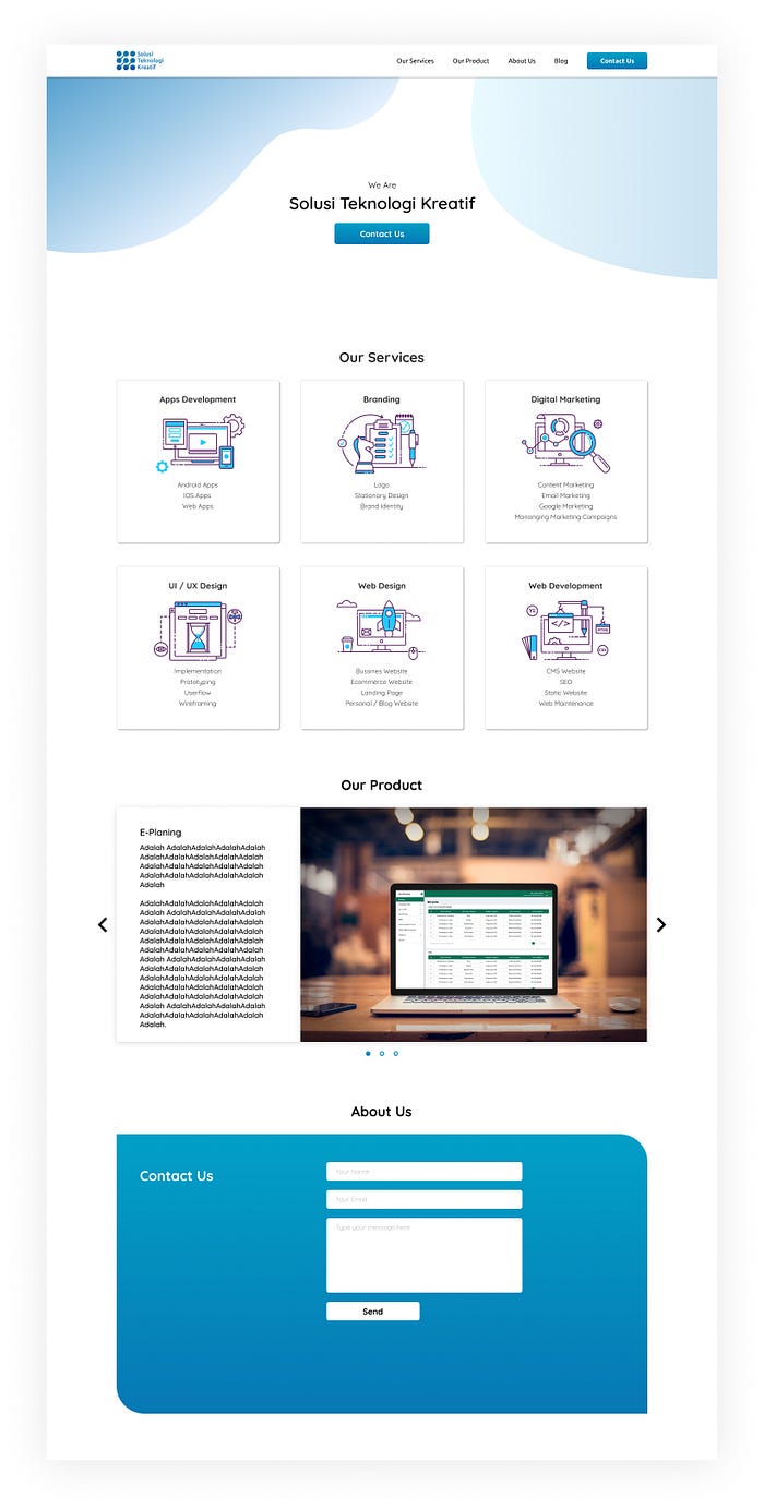
This landing page has the navigation, CTA and product’s information. But it didn’t have the good visuals that persuade the users to use the product. 90% of testers said that this page is ugly and had no sense of design.
The Good Landing Page
Now we know what a bad landing page is like. Let’s move to a good landing page. How should it be? The key is focus on users, not the product. Why? because if we focus on users, the users will be focused on our product. We must be clear about the benefits they will get by using our products. For example, we can provide types of information to users such as “free shipping, no credit cards required, canceled at any time, etc.”. That way, we have reduced the insecurity that users normally have when they first see a new product. A good landing page contains a good visual and is very attractive, but technically, it’s not trigger the user to use the product when they see it. Please take a look of the image above:
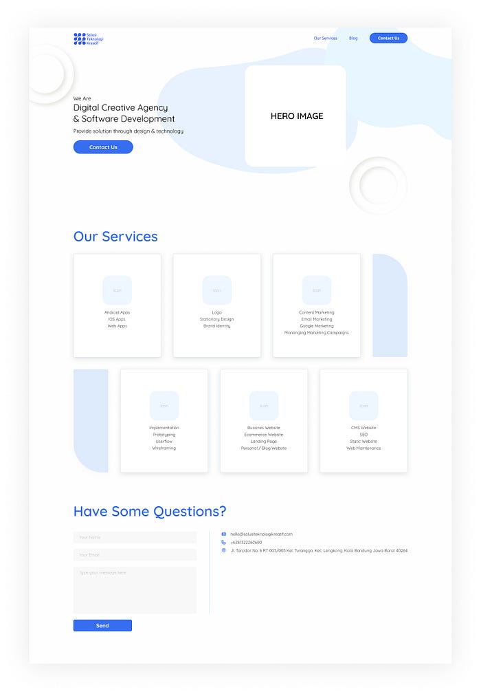
This is a landing page which is a good landing page when users see and test it. This landing page contains 4 landing page principles. But unfortunately information about product services is not very clear, so users are not too sure about the products offered even though the visuals look interesting
The Awesome Landing Page
Isn’t “good” is enough? So what’s the matter with awesome? The awesome landing page has clear information about the product and the path of action is easy to understand. This is an example of an awesome landing page that is made according to its principle:
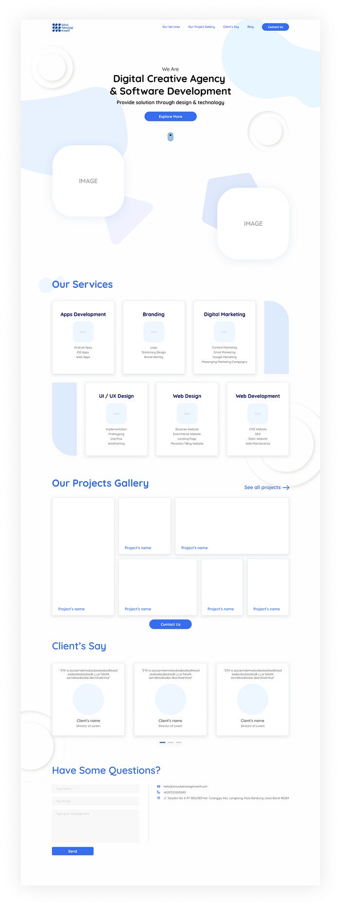
Awesome landing page gives more benefit to the user than a good one. In addition, users will be more engaged with this landing page because they feel it’s like talking to them.
Conclusion
Bad, good and awesome landing pages have the same purpose but are delivered in different ways. It’s better to follow the principles that have been determined, to be the basis for making an appropriate landing page.
Next article, I will share the steps on how to make an awesome landing page with design tools. Thanks for reading!
